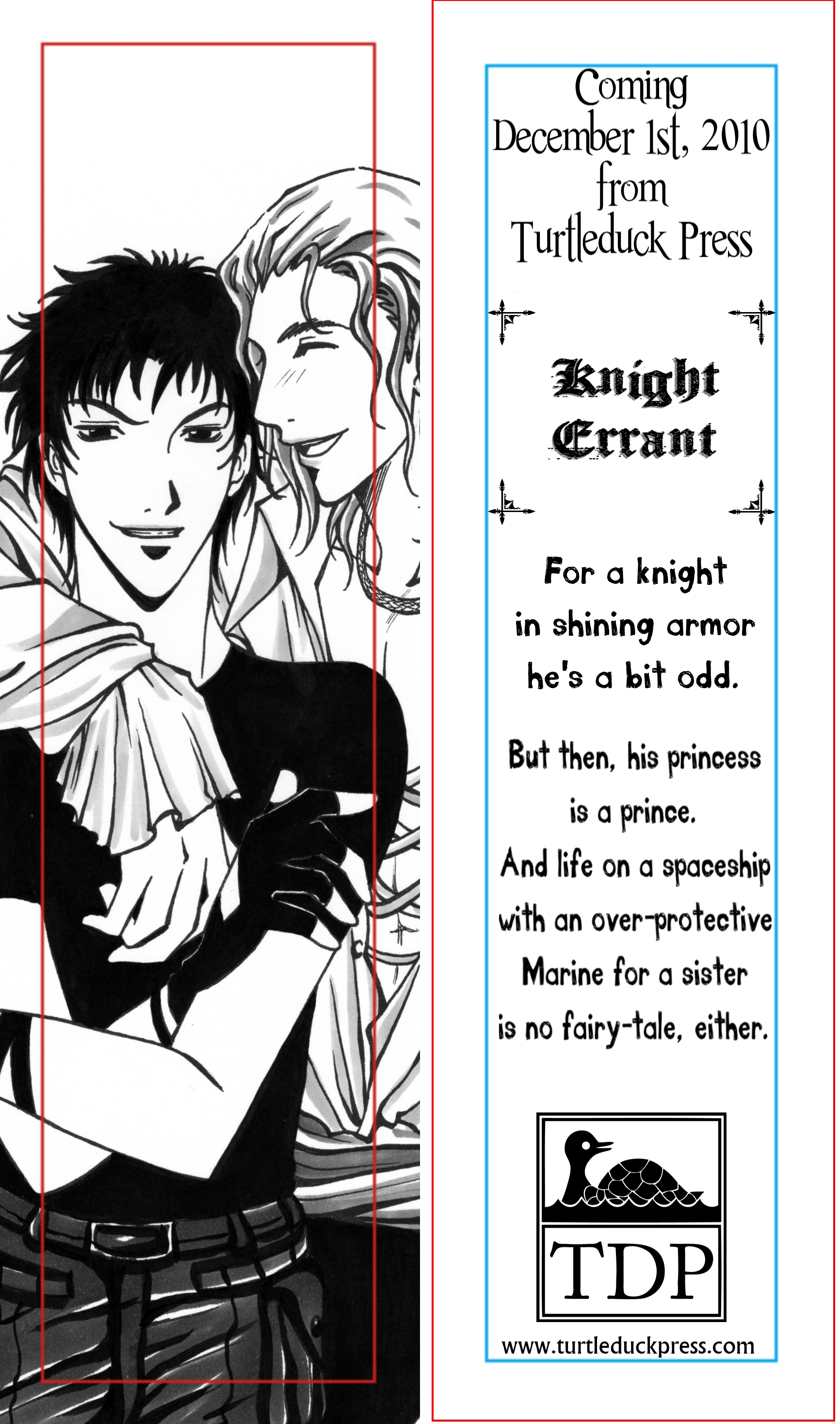
I need to put some information on it, or there’s no point. To break up the information, the easiest way is to use a different font. Too many fonts is the same place…argh.
Tell me what you think. Ignore the various colored lines; they are only guides.

ETA: Better? I think changing the font addresses most of the suggestions.

It might be less font cluttered if you use the same font for Coming Soon as you used for ‘For a knight.’
My other thought would be to put Knight Errant above the picture of Taro, either straight or as an angle.
Maybe just use two fonts, instead of three? Also, the title is set off pretty well with the corners; I don’t think you necessarily have to worry about it, either.
I do agree with you that with it as it is it’s a bit “OMG, FONTS”–the one you have most of the text in doesn’t seem to go with the story, either.
I like the basic layout and the crop on the image, though!
Everything looks great, but I’m not sure about the font on “For a knight in shining armor etc.” A little too … I don’t know, silly? Don’t know exactly what’s off, so I don’t know how helpful this is, but that’s the only off thing I can see.
I like both!
Cheers,
CA
I changed the font, and I also added “Taro’s got a secret…” above their heads on the front. In the font “Coming” and other stuff is in.
Starting to really like this…
I love the second one. I think it’s perfect.